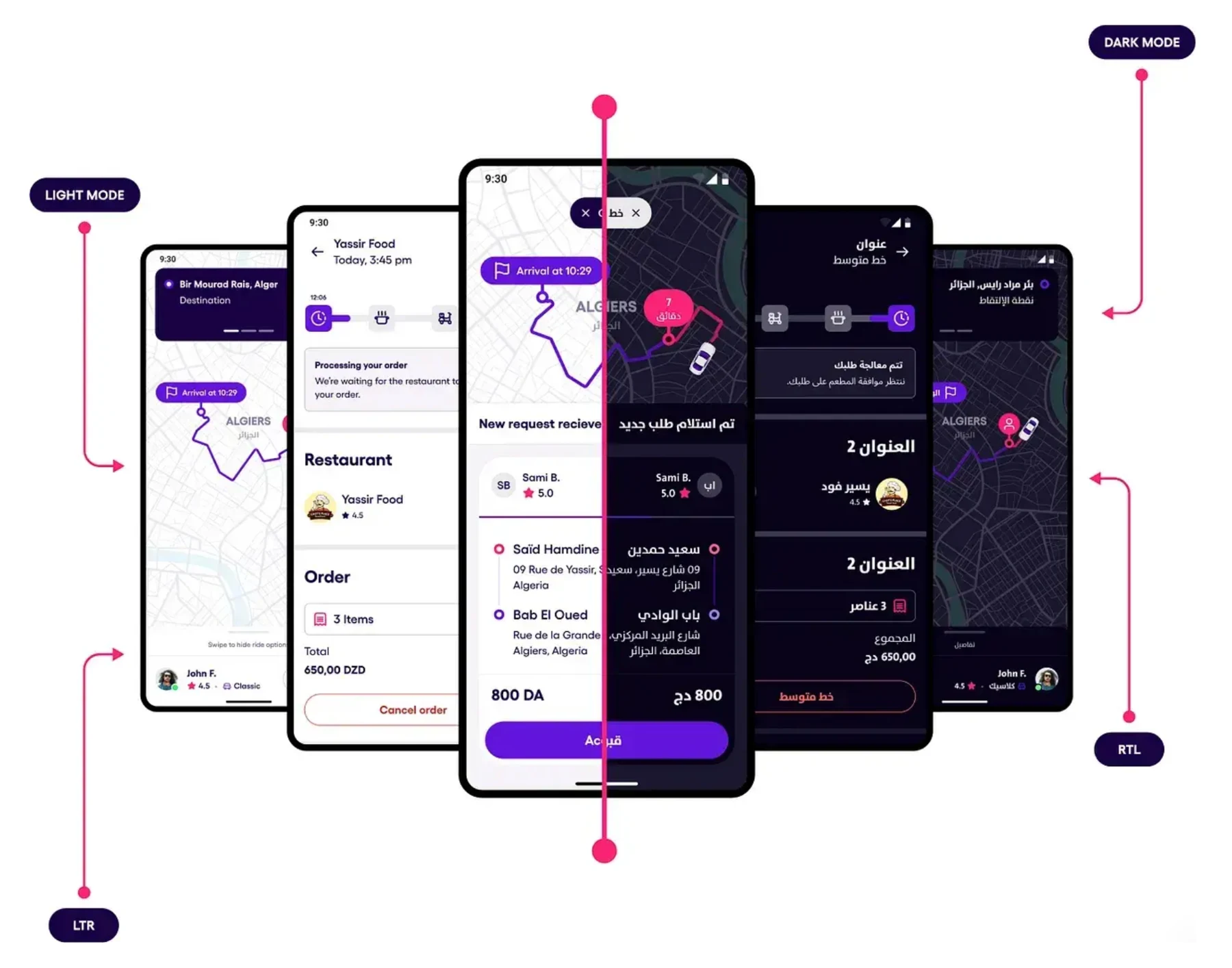
One ecosystem, different product realities.
Rider, Driver, Delivery and B2B had grown independently, with different UI kits and local workarounds. A changing brand added another constraint. Decisions needed to hold across mobile and web, light and dark modes, languages and writing directions.
Evidence & scope
Scale describes the shared system’s scope, not products or markets delivered by me alone.
A 24 × 24 frame is not a visual rule.
Icons could share a frame but still feel unrelated in weight, padding and rhythm. I created guidelines for 16, 24 and 32px sizes: stroke width, live area, corner radius, optical alignment, filled and outline behaviour, states, naming and usage.
Design tokens had to survive a rebrand and a change of script.
I contributed to colour and typography with Mobility and B2B needs in mind. Status colours had to remain meaningful in dense operational screens and dark mode. Arabic required attention to hierarchy, baseline and rhythm, beyond simply choosing a font with the right glyphs.
Start with a product problem. Decide what should be shared.
Weekly component reviews, cross-squad workshops and design critiques brought real problems into the system. Engineering and brand reviews tested whether a pattern could hold beyond one screen. If it solved a local need only, it stayed local.
Consistency is a decision between teams before it becomes a component.
My contribution connected product delivery with shared rules: directly through iconography, and collaboratively through foundations and cross-squad reviews. The system gave teams a place to align while continuing to ship.
Evidence & scope
Collaborative project. No individual claim to the entire system, and no unverified speed or efficiency metric.